Tag: art

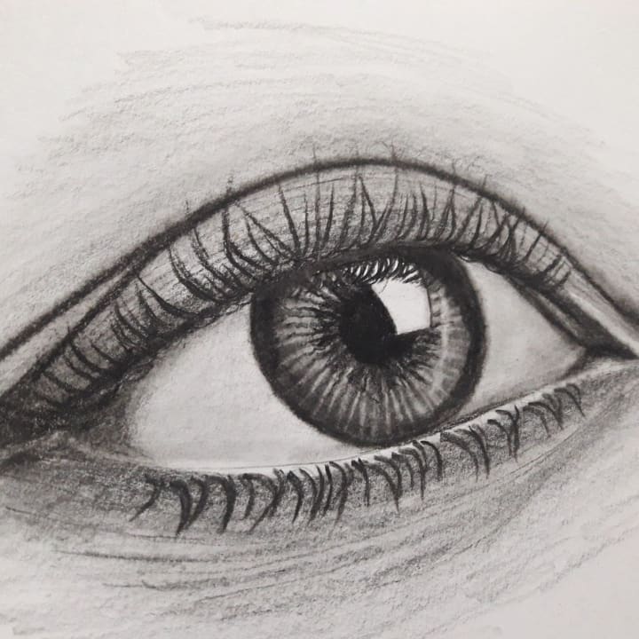
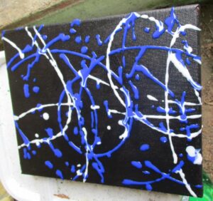
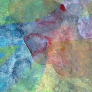
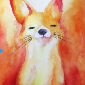
Abstract Art And The Spirit

No Comments


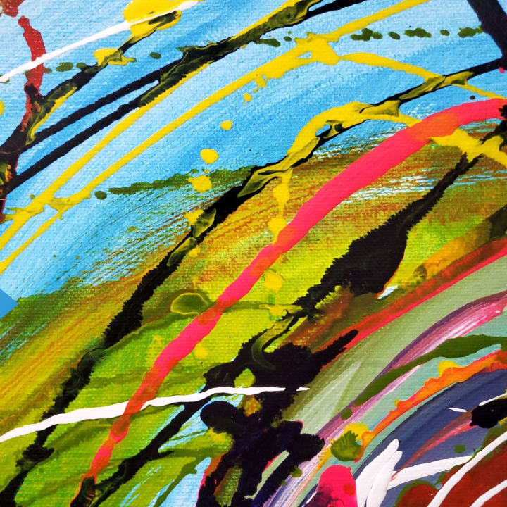
It has been a long and raging arguement that the abstract expressionists of the 50's, 60's and 70's were very busy contemplating their own navels and trying to find the "zen" in everything they did.

I would argue that they were in fact just one very important example of the hungry sleep-drugged soul seeking a way to be heard. However, many artsists of those times, and indeed today, would flatly deny anything remotely to do with spiritual things - or worse still - religious things.

Take, for instance, one of my favourites - Mark Rothko.

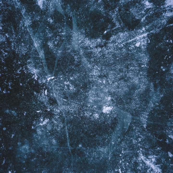
This tragic artist committed himself to the task of producing massive canvases with many vaguely resembling the outline of a window - especially an after image once the eye has closed. His vast expanses of colour seemed to hunt out a corner or edge in a desperate attempt to complete, or conclude, the picture. Not satisfied with that he went on to give up titling his work saying that he did not want to influence the onlooker in any way. Ironically he failed ... and sadly took his own life. For me his works speak of wonderful tantilizing clues visually demonstrating the struggling spirit seeking (and succeeding!) in revealing herself - now that is real influence!

Let me explain by an apparently unrelated route:

I seek to assist my own spirit in attempting to make manifest even the tiniest, most pathetic, weakest fact that the spirit in us all is not only just trying to communicate with us - but is in fact actively seeking to set the whole human balance right ... which is the spirit leading the mind and body back to her source - not the other way round - the mind and body leading the blinded soul to ... well, eventually death.

Not so long ago I came across the writings of Meister Eckhart, a fourteenth century Christian mystic. His words amazed me. He described in his many sermons what he believed to be the truth as to why we are here. He also revealed many tantilizing "images" of the spirit from the least angelic being right up to God Himself. His descriptions were ... how can I put it simply? ... abstract!

In one of his sermons he described God as ... "unknowable" ... "not able to be understood" ... "undefinable". In another he made a statement (one of many which may have contributed to him being accused of heresy!) "People say God exists ... God does not exist ... " left out of context that would be a truly blasphemous assertion. But he went on to say that "... God is far greater ... God is beyond existance". These and many other controversial sayings have impressed me so much that I have come to "see" God as an abstract entity - not, I hasten to add, an anarchic abstract form - but rather a God far more powerful, far more greater - than I can imagine ... in other words totally undefinable. Rather than this putting a distance between me and God, it has done exactly the opposite. And when Eckhart began to describe the life of Christ in an almost completely abstract way - Eckhart said that Christs life was the greatest example of the seeking and finding the uncreated source of the pure soul - my imagination began to run like a film of frenzied obscure visuals. Eckhart has become, to me, the patron saint of abstract artists.

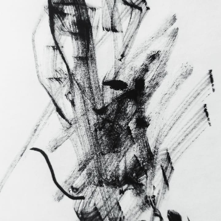
The beauty of Eckharts enigmatic words are intensely inspiring. What better way to illustrate his poetic writings than to describe Gods "isness" in the very basic form of a gigantic flat area of one saturated colour untainted by anythingelse. Strangely enough this could be part of an exact description from one of Rothko's immense, sometimes almost monochromatic, paintings.

But this is by no means the whole story ... one of Eckhart's contradictions said that on the one hand God is totally unapproachable, yet at the same time God is actually very, very approachable ...

However, that is another article.

Categories: art Tags: Tags: , ,

Learning to Draw? You’re Gonna Need a Pencil

No Comments
drawing of an eye

If you're going to be doing any pencil drawing you're going to need a pencil. I know, I know, thank you captain obvious.... But, in this article I want to talk about some of the different options available.

Here are some of the options:
Mechanical Pencils, Lead Holders, Woodless Graphite, And of course traditional wooden pencils

Mechanical Pencils:

You're probably familiar with these. They're the ones that hold the lead (graphite actually) inside and when you push on the eraser more lead comes out. What you may not know is that, like traditional wooden pencils, the leads are available in various degrees of hardness which can be used to achieve lighter or darker tones as needed. We'll talk more about that later.

Lead Holders:

These are somewhat similar to mechanical pencils in that you can use various leads with them. But rather than push a button to release more lead, these pencils actually have sort of a claw that grabs onto and holds the lead. Hence the term "lead holder".

Woodless Graphite:

These pencils are basically a piece of graphite in the shape of a pencil. There are also some woodless graphite pencils that are encased in a laquer coating rather than wood.

Wooden Pencils:

Okay. We all know what a wooden pencil is. It's the yellow one with a pink eraser on top and a number 2 on it. You know, the ones we used to fill in the little circles on our multiple choice tests in school.

Well yes, those are pencils, but a set of good quality drawing pencils comes with a lot more variety than that.

All of the pencil types mentioned above come in varying degrees of hardness and are labled with a number and the letter H or B.

The pencils labled H are on the hard side and the ones labled with a B are the soft ones. I don't know where the "B" comes from but that's the way it is. Pencils range from 9H (the hardest) to 9B (the softest).

The number 2 pencils we're so familiar with are right in the middle in terms of hardness. They're equivalent to an HB pencil.

If you're just starting out drawing or you're just doing some doodling or sketching an HB or #2 will work just fine for you. But, if you want to get a much more interesting drawing you'll have to have some contrast between lights and darks. If all you've ever drawn with before is a number 2 pencil, the way you achieve your darker tones is simply to press down harder.

But there is a better way. That's where the softer pencils come in. After #2 in terms of softness comes B then 2B, 3B ect. all the way up to 9B. Although many artists never use anything softer than a 6B. With a 6B you can get some very dark tones and it's not going to be as soft and thus crumbly as a 9B.

For the harder pencils, I rarely use anything harder than a 2H and that's usually just for the initial line drawing before any shading takes place. Doing the initial line drawing very lightly allows you to erase any mistakes you might have made. Once your line drawing is acurate, it's time to get the softer pencils out and start shading.

So to wrap this up, if you're planning on getting a little more serious with your drawing you'll want to get a set of pencils. There are some sets out there that have just 4 pencils in them. So if you're strapped for cash this is an option. Pencils are also available individually so you can pick and choose whichever number / letter combo you need.

I prefer traditional wooden pencils for my drawings and my brand of choice is Derwent. They make sets of 12 pencils that range from 4H to 6B or from H all the way up to 9B. And, you can get a set of 12 pencils for about $12 - $15 so it's not terribly expensive to get into drawing.

So now go out, get yourself some good pencils, and start drawing....

Categories: art, drawing Tags: Tags: , , ,

Make Some Art Work Today

No Comments
painting of an abstract flower bunch


When decorating a home or office, many people turn to the most popular and expensive stores to find pieces of art work to add to their space. And while this is a great way to decorate and to support your local art industry, it can be costly and make your home or office look just like everyone elses.

A solution: make some of your own art work to display proudly in the places your love.

Making your own art work might sound daunting or unrealistic, but it doesn't have to. It can be much easier and more fun than you think. One of the best things about creating your own art work is that it gives you endless options for decorating uniquely.

Think about it: if you decorate your home or office using just what you find in stores it can be pretty hard to create a unique space or to have a finished product that is really you.

Making your own art work solves those problems. Your art work allows you to make pieces that fit exactly into the plans and dreams you have for your home or office.

Consider the home or office that you are decorating. Take time to dream about the possibilities and keep a list of what things you like and of what you hope your space will turn out to be like.

Consider how a few well-made pieces of art work could add to the uniqueness and beauty of your space.

Would a painting of a beach scene fit perfectly into your living room? Would a piece of pottery adorn your bookshelf in the perfect way? Don't let your lack of artistic abilities keep your mind from dreaming. At this point, consider all possibilities and leave worrying about the 'how' for later.

Gather ideas for your art work from as many sources as you can. Look in decorating magazines, in store catalogs, online, or even in the homes or offices of your friends. Keep your eyes peeled for ideas no matter where you are! The perfect piece of art work for your space could be similar to something you see with a few simple modifications.

Once you have a few ideas about art work that could make your space beautifully unique for you, then begin the process of figuring out how you can make your art work. Perhaps it will be as easy as visiting a local art supply store to gather the right materials, or perhaps you will need to enroll in an art class or two. Whatever it takes, stick with it.

Creating unique art work for your home or office will be worth it no matter what. Friends and family will marvel at the beauty of your space and at how perfectly it fits you.

Categories: art, artistic Tags: Tags: , , ,

Buying An Abstract Painting

No Comments
watercolour pour

You may be mistaken in thinking that buying a piece of abstract art would be a simple thing to do. You just select the work you want... and buy it!

The truth will creep up on you as soon as you look at the first painting "it is not quite the right one, so I will look for another".

Here is the first realization - and question to ask yourself - why exactly is this piece you are looking at "not quite right"? The answer can be manifold:

1. It includes a colour I do not like
2. I am not sure it will go with another item in the space I would like to place it
3. A slow realization that a certain personal undesirable association is being emitted from the painting
4. It looks great but I am not sure it will fit the space
5. It is just right but the price is a little bit more than I wanted to pay... and the list goes on.

Although I do not have all the answers I will endeavour to reveal, from my own personal experiences, a few solutions.

So, you see a picture you like but the colour combination is wrong. Put simply the thing to do is to contact the artist and tell them your dilemma. You will find that some of them will either be able to reproduce a similar work in the colours you prefer, or they will be willing to notify you when and if they produce a work that might be nearer to the colours theat you require.

If size is an issue then I would advise the same as above - contact the artist and tell them the problem. I believe you will receive a similar reply to that which I have written above.

Make sure that when you do make a purchase that the artist is offering a return policy. I have a ten day return policy which means that if you buy a painting and hang it in your space - if within ten days of purchasing it you become uncomfortable with it for any reason and you cannot live with it, then you may return the piece and your money will be returned. An important point here worth mentioning is the fact that you have made certain decisions on buying this piece of work, therefore it is worthwhile mentioning it to the artist which will enable them, if they so inclined, to produce a work that has omitted the undesirable entity. This way you may well end up with a work that will be of greater value to you - having communicated your dilemma.

Price can be a tricky challenge - but many artists offer different ways to help you buy the piece you want. If, for instance, the piece you like is too expensive for you then you have a number of choices. Perhaps the most preferable choice is for you to negotiate the price with the artist. However, please bear in mind that the artist has produced a totally unique painting - there is nothing like it in all the world! Also spare a thought for the fact that the artist will have spent time struggling to get the work out onto the canvas.

A well known saying is that a piece may well have taken only a few hours to produce, but you should also take into account the years the artist has been at work -

so if someone says to me "it can only have taken you three hours at the most" I reply "no... it has taken me FORTY YEARS and three hours!"

If you keep these in mind then negotiate with what you might see as a realistic price for you and a price that will have taken the above into account for the artist.

Some artists will not barter prices - but they may be willing to sell you the work if you pay by installments. You have to ask yourself here "Do I REALLY want this piece?" If you answer yes then you will find the money... because you want to - you want the work.

Let us say that you see an artists work - you love the style - you would very much like to have a painting on your wall... but you see nothing that grabs you. Try contacting the artists and commissioning them to painting you a picture... this way you may be able to influence the end result by instructing the artist to use certain colours, or specific shapes. Or if they are not inclined to work that way then they might put you on their mailing list that will inform you when their latest piece is about to go on show - you will be offered "first refusal".

One final thing worth mentioning is the fact that a growing number of artists are making their works available as high quality giclee prints. These reproductions are very close to the original work, and some of the reproduction houses actually ensure that every brush stroke has the appropriate texture and "feel". So in many ways you could purchase a work that is almost identical to the original piece except for one very big fact - the price of the print. The print will be of a limited edition, making it a collectible investment - and it will have been checked, numbered, and signed by the artist.

If none of the above proves to be useful to you then the simplest thing to do is contact the artist and just talk to them, tell them what you think of their work, what you are looking for - anything... just communicate with them, and I think you will find that you will not only buy yourself something that you will love and cherish ... but you will also bond with the artist themself in a way that you could never do if you walked into a place selling paintings and chose a piece hanging on a wall.

Categories: abstract, art Tags: Tags: , , , ,

Creating textures in visual art

No Comments
blue texture painting

Creating textures in any visual art gives the art excitement, movement, and variety. Somehow an otherwise drab looking artwork comes alive when textures and texture contrasts are incorporated into the painting. Aside from that, depths and shades are better executed, monotony is removed, and interests are sparked.

There are combinations and variants in creating texture some of the most often practiced are:

Splattering textures involves loading a brush with color and tapping the brush at a height to towards the paper. Care is observed when splattering a texture since too much water in the brush might lead to big blots and blobs that will not be as easy to control. Another technique at splattering a texture is to use a pencil or the handle of another brush when tapping the brush that is loaded with color unto the paper.

Spraying textures is very much like splattering although in this technique the artist use toothbrush instead. Since toothbrushes are made of nylon and could therefore not hold much paint and water, charging the toothbrush with paint from a paint brush is preferred rather than dipping the toothbrush in a puddle of water diluted color. Again care is observed that the toothbrush is not loaded with too much water as dripping will ruin the work. To spray the texture, rake the bristles of the toothbrush along the points where sprayed textures are desired.

Sgrafitto Textures. Sgrafitto is scratching a layer of paint to reveal the paint underneath. To do this, use thin plastic materials that you could hold firmly or the angled scrapers built into (some) brushes to scrape the underlying colors. This technique is used for detailing flora, branches, and trees.

Stamped Textures. Stamping is applying color using just about anything except the brush. Organic materials are the favorites like leather, sponges, laces, leaves, cross section of tubers; possibilities are endless as textures are. The most commonly used though are sponges and tissue papers. Sponges for example are dipped into the color and applied into the paper to form shapes that are intended.

Back Wash Textures remains the widest used texture in watercolor painting. Backwashing involves the laying of a predetermined area with color and while still wet lays another color that creates and interesting mix as the color merges. The texture is influenced by the natural conduction of water to leave different marks on paper depending on its degree of dryness, wetness, and texture. After that, the brush is dipped in water and flicked over the painting further creating textures and shapes of interesting value as the colors merge.

Alcohol Textures creating this texture is very similar to the backwash and the splatter except that instead of water, alcohol is flicked over the artwork. The chemical composition of the alcohol creates interesting patterns on the paper very different compared to pure water flicking.

Salt Textures. The natural action of salt when it is sprayed in small amounts of water is that it tends to absorb it. This absorption creates patterns different from that of flickering alcohol of pure water. Salt however will accelerate the rotting of the paper over time. In creating textures with similar effect, some artists use saw dust instead that will be brushed off when the painting dries.

Categories: texture, Watercolour Tags: Tags: , , , ,

Almost all artists learned first and then studied later

No Comments
drawing of an eye

Almost all artists learned first and then studied later. From the greatest to the least, every one of them practiced and learned with very little guidance if any. Along the way though, without exception, mistakes are made and as realization ultimately comes, are corrected.

The following is a compilation of the most common mistakes in drawing that you would want to avoid.

  • Do not start drawing with a hard pencil. Hard pencils are good for light shading but if you must start sketching use instead pencils with darker values like a 2B or a 4B.
  • When you are a beginner, do not use flash photography as reference. Flash photography because of the nature of its lighting gives you no depth to work on. Aside from that, perspective points are located behind the head that tends to flatten the features and expressions more. Even professional artists find it very hard to duplicate the expressions on a face when using flash photography. Making it harder is the fact that there is often a smile in the snapshot. The sketches from snapshots are more likely to produce faces that grin without a lively mirth to it.
  • If you must sketch a face, the model should face slightly to one side. This way you could have a good evaluation of skin tones, lights, and shadows that are natural and the natural expressions of the personality behind the sketch that you are working on.
  • Sketch for balance. Focusing much on a person’s feature especially those that stands out will tend to overemphasize a particular feature drawing them too big making the rest of the head out of proportion.
  • When starting to sketch, start with light stokes and ensure that the features of the model are in the correct angle with the rest of the head. This mistake is one of the most common as we are used to looking at a face straight on that when an angle is done, twitching and distortion of features occur.
  • Most sketches are not shaded past grey, when you shade, do not hesitate to go darker. It will add more strength and expression, give your drawing more depth and drama. Limiting your shades to dark grey decreases your tone range. So experiment with darker values. To get a better idea, have a dark colored (even black) paper at the edge of the drawing and use it for tone reference.
  • Choose the paper well. Papers that are manufactured with sheen on the surface will result to pale drawings, as the paper is too smooth to hold pencil particles. On the other hand too coarse a paper will hold too much of pencil particles that your application of shades will be off. Select a paper which is neither too coarse not too smooth.
  • When sketching foliage, do not use circular hand motion and strokes. Use instead crescent shaped marks. That way your foliage and trees will appear more natural and realistic.
  • Among the common mistakes in drawing grass or hair is to draw every blade and every hair leaving a mangled wiry effect. Use contrast instead. To avoid this, apply also feathery light pencil strokes.

But of course, you need to make mistakes to progress so don’t worry if you do a terrible drawing. To get better, you need to make mistakes.

Categories: drawing Tags: Tags: , , ,

Watercolor techniques improve as time passes

No Comments

The following are the most popular watercolor techniques that have been developed by the artist themselves:

1. Wash Technique
It was developed by Albrecht Durer, a German artist. It permits overlapping layers of highly diluted pigments to a more refined level. It started in the early 16th century. In the 18th century, wash became the vehicle for color and the whiteness of the paper is reserved for highlight purposes.

2. Aquarelle Technique
It was mastered and developed by John Cotman and J.M.V Turner, both English artists. Aquarelle technique is more concentrated on thin washes.

3. Watercolor Technique with oil and acrylic based paint
It started at around 19th and 20th century. It dilutes oil paint with solvent to give a washy thinness. It is the newest watercolor technique that is used nowadays by some artists around the world. It also allows the paint to flow freely over the painting surface. Most schools around the world are more concentrated on teaching this technique to their students. Pablo Picasso and John Miro mastered this technique.

Watercolor techniques are combined with reiteration of the themes and styles developed. Many artists never stop to experiment on new2 materials and forms of expression. The watercolor technique will be chosen by the artists themselves. It is important because they are the ones who know what technique is applicable for their masterpiece. Amateur artists may also attend workshops in order to learn more about these techniques.

Watercolor techniques improve as time passes. Several ways are used in order to create a new set of development. With the help of these new improvements, several artists nowadays are getting more inspired to create watercolor paintings. Even the younger children try it out for themselves.

Watercolor brings a different vibrant to paintings creating a surreal approach to the eyes of its audience. Using the watercolor techniques, paintings became more interesting and relaxing to see. It shows the creativity of the artists in the whole world. It gives a new dimension for the artists to showcase their talent. With their watercolor paintings, many people are filled with joy and inspiration.

Watercolor techniques are ways to create a masterpiece. It’s in the hands of the artist to use it evenly on the paper with its chosen theme. If effectively done, the artist will surely create a majestic piece of art that can be enjoyed by its audience. Indeed, using the watercolors, such artists can create and express themselves better with their paintings. It is a medium that can easily be used by everyone that enjoys and loves painting.

With the help of these medium, people can divulge themselves to a new innovation in art. With the help of the watercolor, it moves freely in the hands of the artists.

Categories: Watercolour Tags: Tags: , , ,

Watercolour is a Challenging Medium

No Comments

Watercolor painting can pose challenges different from other mediums.

watercolour pour

For example, watercolor is a transparent medium making it unique when compared to other mediums that are opaque. To address this, the following are the watercolor basic painting techniques developed and used over the years and which no watercolor artist can do without.


Dry Brush

the dry brush technique is good for creating textured surfaces. Samples of dry brush technique are often seen in watercolor paintings of tree barks, rocks, twigs, foliage etc. creating a visibly dominant textures. Dry brush painting relies on painting with a brush that is just about moist and often charged with a thick paint. The dominance or the subtlety of the effect will depend also on the grade and quality of the paper used and the angle and stroke applied.

Lifting Wet Watercolor

The tools to use when applying this technique are soft tissue paper, sponges, paper towels, or brushes. Lifting is a negative painting tool where instead of applying color, you diminish the color that is applied. It creates a dreamy effect and is widely used when painting clouds where the paint, while still wet is dubbed with the absorbent tool to create the image desired. Twisting is done to create more texture in the paint that is left on the paper as well as scrubbing. When doing the actions though, especially when scrubbing, care must be observed that the paper underneath is not damaged.

Lifting Dry Watercolor

One of the greatest challenges in watercolor painting is its being a transparent medium which makes it very difficult to remove or blot out. Once it is in the paper and dries, removing the paint is difficult if not impossible. Painting over will hide it partially. Just the same, sometimes a pigment has to be lifted from the artwork and for lifting dry watercolor, what is normally used are acrylic brushes or sponges. To lift the dry pigment, the sponge or the brush is cleaned thoroughly with clean water and applied very carefully to the surface. The process is repeated until manageable tinge of color remains.


Other tools used are razors, sandpapers, penknives, and sometimes X-acto blades. All of which are destructive. Blades are used but then the texture of the artwork is altered. In skilled hands highlights will be created when using a blade but as mentioned it is a risky process.

flow watercolor

Wet in Wet

It is another watercolor basic painting technique where the paper is brushed wet before applying pigments. This technique produces a very different texture and appearance that is unique only to watercolor paintings. For more watercolour tips, go to https://artisgreat.ca/watercolour-tips-for-painters

Watercolour Tips for Painters

No Comments

Following are some tips to improve your Watercolour painting which you may or may not have thought of as you develop your watercolour skills.

paper
  1. Paper quality

There are different kinds and grades of watercolor and watercolor paper, each has its own consistency and behaves differently. The quality of the watercolor painting is heavily influenced by the grade of paper that the painting is on. This is more pronounced when applying the techniques such as wet in wet and dry color lifting. Texture grade are also important consideration when applying a dry brush technique. The rule of the thumb when choosing a watercolor paper is that the more expensive and popular the brand used, the easier the work becomes for the artist because of the consistency and the high quality of materials that are used.


flow watercolor


2. Working fast

There are a variety of effects that could be taken advantage when working fast. First, to regulate the paint flow will not allow the artist to rest until a particular aspect of the work is finished. The effects that are obtainable in working fast allows for better blending and mixing of colors that could never be done when the paint is allowed to thicken let alone dry. The same goes for color dominance, and the production of feathery, rugged edged and dreamy textures that only a watercolor could produce. Watercolor is not an easy medium to work on. But for those who will or have learned to regulate the flow of the paint, the wetness inherent to watercolor painting is actually a good control device.


3. Light fastness

Light fastness is also a major consideration when you want the painting preserved. Watercolor pigments have acquired a reputation for impermanence because unlike oil and acrylic that has protective binders, watercolors are painted directly on paper and is exposed. Because of this, that pigments do not retain its color and its brilliance overtime. Today though, major improvements have been done to retain lightfast watercolors which is indicated by a manufacturers numerical rating printed in the tube or the packaging.

The main reason that excellent watercolor paintings are considered less in value than oil or acrylic is its previous inability to hold its color. Today though, technological improvements are achieved for watercolor pigments that in fact, watercolor paintings with high light fastness rating painted on archival paper holds it colors and brilliance longer than oils and acrylics.

4. Tube or Pan

Choose tube. It is more difficult to achieve very dense color when you use a dry watercolor from a pan. It is also easier to keep raw colors in tubes. Minor difference but it counts for coming with very good, well preserved and well-defined colors. Other than that, there is no visible difference between a tube color and those that comes from pans.


5. Scumbling

While the preceding watercolor painting tips are relatively new, scumbling dates back to the practice of watercolor application in the 19th century. Otherwise known as dragging or crumbling the color, scumbling is loading a moist brush with large amounts of color and dragging the tuft lightly along the paper to produce different textures and are typically used by watercolorists with more advanced brush handling skills.

Categories: Watercolour Tags: Tags: , , , , ,