Month: August 2022

A Quickie Art Primer

No Comments

Learn the difference between Multiple Originals, Original Prints and Reproductive Prints and become an informed art buyer.

Most collectors understand and feel knowledgeable when speaking of singular original works of art like paintings, pencil drawings, pen and inks, acrylics, watercolors, etc. hTe artist has created one work of art with his own hand. The surface might be paper or canvas or even masonite.

colour black white print of face

A bit more complicated are Multiple Originals…commonly called Original Prints.

Traditionally, the artist creates a master image for the purpose of making a small number of prints that he will sign and number. The master image might be created upon a block, stone, plate or screen  any of which assists in conveying the image to the print surface.

The blocks, plates, stones and screens cannot be considered originals. They are just vehicles to produce Original Prints.

Next there are Reproductive Prints.

The artist has produced an original work…and photograph technology and automated printing equipment create reproductions. Fine art print reproductions are usually signed and numbered in limited editions and care must be exercised so they remain in mint condition in order to preserve their value.

A similar, but much advanced process, creates giclees which is the state of the art prints now taking the art collecting world to a whole new level.

Creating textures in visual art

No Comments
blue texture painting

Creating textures in any visual art gives the art excitement, movement, and variety. Somehow an otherwise drab looking artwork comes alive when textures and texture contrasts are incorporated into the painting. Aside from that, depths and shades are better executed, monotony is removed, and interests are sparked.

There are combinations and variants in creating texture some of the most often practiced are:

Splattering textures involves loading a brush with color and tapping the brush at a height to towards the paper. Care is observed when splattering a texture since too much water in the brush might lead to big blots and blobs that will not be as easy to control. Another technique at splattering a texture is to use a pencil or the handle of another brush when tapping the brush that is loaded with color unto the paper.

Spraying textures is very much like splattering although in this technique the artist use toothbrush instead. Since toothbrushes are made of nylon and could therefore not hold much paint and water, charging the toothbrush with paint from a paint brush is preferred rather than dipping the toothbrush in a puddle of water diluted color. Again care is observed that the toothbrush is not loaded with too much water as dripping will ruin the work. To spray the texture, rake the bristles of the toothbrush along the points where sprayed textures are desired.

Sgrafitto Textures. Sgrafitto is scratching a layer of paint to reveal the paint underneath. To do this, use thin plastic materials that you could hold firmly or the angled scrapers built into (some) brushes to scrape the underlying colors. This technique is used for detailing flora, branches, and trees.

Stamped Textures. Stamping is applying color using just about anything except the brush. Organic materials are the favorites like leather, sponges, laces, leaves, cross section of tubers; possibilities are endless as textures are. The most commonly used though are sponges and tissue papers. Sponges for example are dipped into the color and applied into the paper to form shapes that are intended.

Back Wash Textures remains the widest used texture in watercolor painting. Backwashing involves the laying of a predetermined area with color and while still wet lays another color that creates and interesting mix as the color merges. The texture is influenced by the natural conduction of water to leave different marks on paper depending on its degree of dryness, wetness, and texture. After that, the brush is dipped in water and flicked over the painting further creating textures and shapes of interesting value as the colors merge.

Alcohol Textures creating this texture is very similar to the backwash and the splatter except that instead of water, alcohol is flicked over the artwork. The chemical composition of the alcohol creates interesting patterns on the paper very different compared to pure water flicking.

Salt Textures. The natural action of salt when it is sprayed in small amounts of water is that it tends to absorb it. This absorption creates patterns different from that of flickering alcohol of pure water. Salt however will accelerate the rotting of the paper over time. In creating textures with similar effect, some artists use saw dust instead that will be brushed off when the painting dries.

Categories: texture, Watercolour Tags: Tags: , , , ,

A Look At The Crystal Bridges Museum of Art

No Comments

Some critics might say Jasper Cropseys The Backwoods of America, part of the Crystal Bridges growing American Art Collection, is a symbolic icon for billionaire Alice Waltons passion for the arts.

Designed by world renowned architect Moshe Safdie, and funded by billionaire Alice Walton, the 50 million dollars that is just the cost of the facility and does not include the artworks Crystal Bridges Museum of American Art is in Bentonville, Arkansas.

The museum will house a permanent collection of signature works from American artists along with galleries dedicated to regional art and artists including Native American art, but oddly enough, this monumental task is not making everyone happy.

The depth of the museum is indicated in a purchase from Christies Americas auction house in New York City in 2004 of Charles Wilson Peales portrait of George Washington for $6.1 million. This is causing some critics to puff up, believing that the art works are being snatched from their own backyard. No need to worry, collaborating with other institutions will be an important focus of Crystal Bridges, even before the museum opens, and they can also rest easy to know Bentonville does have an airport.

A number of the works from the Crystal Bridges permanent collection are already on loan at various museums throughout the United States including: The Hudson River School masterwork Kindred Spirits which was loaned to The National Gallery in Washington, D.C. for public viewing from 2005 – 2007. It is currently on loan to the Brooklyn Museums exhibition by the same name featuring the works of Asher B. Durand. The same exhibition will also travel to Washington D.C. and San Diego.

Thomas Eakins Portrait of Professor Benjamin H. Rand is currently on loan to the Philadelphia Museum of Art. Jasper Cropseys majestic depiction of early American frontier life, The Backwoods of America, is now featured in the American galleries of The Nelson-Atkins in Kansas City, and the most extensive surviving group of Colonial American portraiture, the Levy-Franks family paintings, is currently on loan at The Jewish Museum in New York City. Also, the distinctive painting George Washington (The Constable-Hamilton Portrait) by the American painter Gilbert Stuart is currently on view at the Museum of Fine Arts Houston.

While the puffers puff, others admire Waltons passion and dedication to the arts, and recognize the fact Crystal Bridges will be the premier American Art Collection, once it is in place. The collection is headed up by Bob Workman, formerly associated with the Amon Carter Museum in Fort Worth, Texas.

The museum complex will encompass approximately 100,000 square feet of gallery, library, meeting, and office space, a 250-seat indoor auditorium, areas for outdoor concerts and public events, gallery rooms suitable for large receptions, as well as sculpture gardens and walking trails. Walton is building this American Dream on 100 pristine, wooded acres her family owns in Bentonville.

Categories: art Tags: Tags: , , , ,

7 Ways To Ensure Your Artwork Is Print Ready

No Comments

A quick guide on what to think about when preparing your artwork for printing.

It is important you follow these guidelines as any errors made are likely to cause a delay or cause unnecessary stress should the final print quality be sub-standard.

1. Check your files
Check your artwork for spelling mistakes, grammar and ensure all images used are high resolution.

Double check to make sure as any errors found will delay the turnaround of your product.

2. Bleed
Bleed is the extra bit of the design page which you design on, as normal, with the knowledge that it will be trimmed off the finished flyer.

Any images on your artwork should bleed off the page, and essential text should be away from the trim edge by a good few mm’s.

We use a 2mm bleed area on each edge.

3. Text
Keep essential text away from the edge of the flyer, by about 8-10mm for best results.

4. Print Resolution
Ensure your artworks resolution is at least 300dpi. The higher the resolution the better.

5. File Formats
If you are using un-common fonts, ensure you supply your artwork as a flattened jpeg or tiff. This will ensure there will be no font problems when your artwork is checked.

The most commonly accepted program formats are Quark, Illustrator, Photoshop, Corel Draw, Corel Paint, Freehand, InDesign and Paint Shop Pro. Vector files such as .eps and pdf’s are becoming more common and ensure a better end product.
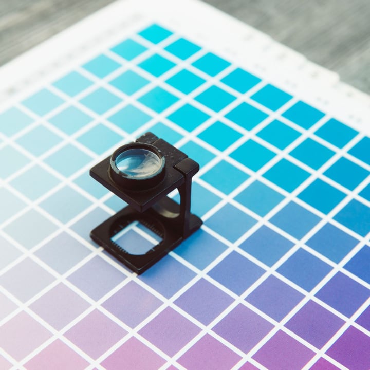
6. Colours
Unless you have a calibrated monitor your artwork is likely to have slightly different colours when printed. Ensure your colour choices are correct before sending to print.

7. A Final Check
Before sending to your printer, have one more final check that everything is as expected.

WARNING
There are two things you should consider when designing your prints:

Due to the quick turn around of our flyers, they are trimmed down not long after they are printed, in most circumstances we try to give a printed sheet 8 hours to dry completely, this isn’t always the case. This is noticeable when one side of the print is left white, and the other side bleeds rich colour to the trim edge. This will cause slight powdering of the rich ink over, on to the white side. In this circumstance we recommend the use of borders.

Borders on the edge of a flyer, can sometimes give the flyer a classic look. But make sure the borders are a good few mm in from the trim edge, because of the way we print flyers (up to 32 at a time) and the speed at which we turn them round (from payment, to your door) these borders may not be an accurate trim to the exact 10th of a mm. This is why we ask for a 2mm bleed. The cutting blade could go either way. We cannot be held responsible for imperfect results if these borders are slightly uneven.

These are some of the things you have to check before you send your artwork to the printer for high-quality prints.

Almost all artists learned first and then studied later

No Comments
drawing of an eye

Almost all artists learned first and then studied later. From the greatest to the least, every one of them practiced and learned with very little guidance if any. Along the way though, without exception, mistakes are made and as realization ultimately comes, are corrected.

The following is a compilation of the most common mistakes in drawing that you would want to avoid.

  • Do not start drawing with a hard pencil. Hard pencils are good for light shading but if you must start sketching use instead pencils with darker values like a 2B or a 4B.
  • When you are a beginner, do not use flash photography as reference. Flash photography because of the nature of its lighting gives you no depth to work on. Aside from that, perspective points are located behind the head that tends to flatten the features and expressions more. Even professional artists find it very hard to duplicate the expressions on a face when using flash photography. Making it harder is the fact that there is often a smile in the snapshot. The sketches from snapshots are more likely to produce faces that grin without a lively mirth to it.
  • If you must sketch a face, the model should face slightly to one side. This way you could have a good evaluation of skin tones, lights, and shadows that are natural and the natural expressions of the personality behind the sketch that you are working on.
  • Sketch for balance. Focusing much on a person’s feature especially those that stands out will tend to overemphasize a particular feature drawing them too big making the rest of the head out of proportion.
  • When starting to sketch, start with light stokes and ensure that the features of the model are in the correct angle with the rest of the head. This mistake is one of the most common as we are used to looking at a face straight on that when an angle is done, twitching and distortion of features occur.
  • Most sketches are not shaded past grey, when you shade, do not hesitate to go darker. It will add more strength and expression, give your drawing more depth and drama. Limiting your shades to dark grey decreases your tone range. So experiment with darker values. To get a better idea, have a dark colored (even black) paper at the edge of the drawing and use it for tone reference.
  • Choose the paper well. Papers that are manufactured with sheen on the surface will result to pale drawings, as the paper is too smooth to hold pencil particles. On the other hand too coarse a paper will hold too much of pencil particles that your application of shades will be off. Select a paper which is neither too coarse not too smooth.
  • When sketching foliage, do not use circular hand motion and strokes. Use instead crescent shaped marks. That way your foliage and trees will appear more natural and realistic.
  • Among the common mistakes in drawing grass or hair is to draw every blade and every hair leaving a mangled wiry effect. Use contrast instead. To avoid this, apply also feathery light pencil strokes.

But of course, you need to make mistakes to progress so don’t worry if you do a terrible drawing. To get better, you need to make mistakes.

Categories: drawing Tags: Tags: , , ,

7 Drawing Tips for Beginners

No Comments

A child’s first scribbling is something which it tries to express if you give a pencil in his hand. Drawing is relatively very simple and an easy skill and is something with which you can have great fun. It is also relatively not a very expensive hobby and can start with paper and a pencil. It can go on till acquiring costly pen and tablets – a computer hardware through which you can draw on your computer. It is very costly; however the precision for perfection is very high.

Unlike earlier days, getting information on drawing and sketching is very easy and inexpensive. You can search information on Google and get various sites which teach drawing. Also, nowadays this art form is liked by many youngsters. Like all other art forms, with constant and systematic practice one can become a great artist.

Listed below are few drawing tips which can help anyone improve their skill and become an artist. Reading and practicing these in your daily routine will improve your skill.

1. If you are drawing and you are right handed person, ensure that the light is from your left side. This will prevent your hand shadow falling on your paper.

2. First step when you practice drawing – you should practice drawing line, straight line, curved line, scribbled lines, and your hand should obey the command of your thoughts and visions. You should control your hand and you should be able to bring out what you want.

3. You should further develop drawing circles, oval shapes, crossed lines and bold and thick lines. Just like how a baby develops from crawling stage to walking stage, your art should also develop step by step.

4. These lines and curves are like pillars to a building. The foundation should be strong enough to have a good building; similarly these initial small lines and curves will go a long way in your career. You should also start controlling the stress on your pencil. You should be able to bring the correct darkness and thickness in the lines what you draw.

5. Initially you will not be able to draw a circle or an oval shape correctly, nevertheless don’t get discouraged. You should practice and practice until you get perfection. You should also keep all your drawings carefully from the start to know how you are improving. You could also date your sketches and preserve it for the future.

6. You should concentrate in the area where you feel you are weak. If you are not able to shade properly then learn more to do that. You can try out your own style of shading. Build your own individuality, never copy from another artist.

7. Last but not the least, use good quality materials. 4B and 6B pencils and good chart paper or note book with good quality paper should be sufficient to start with. Quality definitely matters hence never compromise on quality.

Watercolor techniques improve as time passes

No Comments

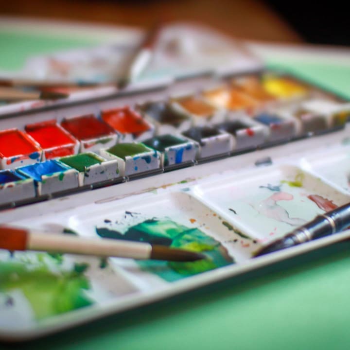
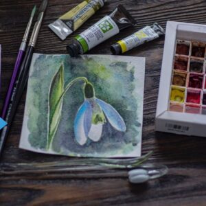
The following are the most popular watercolor techniques that have been developed by the artist themselves:

1. Wash Technique
It was developed by Albrecht Durer, a German artist. It permits overlapping layers of highly diluted pigments to a more refined level. It started in the early 16th century. In the 18th century, wash became the vehicle for color and the whiteness of the paper is reserved for highlight purposes.

2. Aquarelle Technique
It was mastered and developed by John Cotman and J.M.V Turner, both English artists. Aquarelle technique is more concentrated on thin washes.

3. Watercolor Technique with oil and acrylic based paint
It started at around 19th and 20th century. It dilutes oil paint with solvent to give a washy thinness. It is the newest watercolor technique that is used nowadays by some artists around the world. It also allows the paint to flow freely over the painting surface. Most schools around the world are more concentrated on teaching this technique to their students. Pablo Picasso and John Miro mastered this technique.

Watercolor techniques are combined with reiteration of the themes and styles developed. Many artists never stop to experiment on new2 materials and forms of expression. The watercolor technique will be chosen by the artists themselves. It is important because they are the ones who know what technique is applicable for their masterpiece. Amateur artists may also attend workshops in order to learn more about these techniques.

Watercolor techniques improve as time passes. Several ways are used in order to create a new set of development. With the help of these new improvements, several artists nowadays are getting more inspired to create watercolor paintings. Even the younger children try it out for themselves.

Watercolor brings a different vibrant to paintings creating a surreal approach to the eyes of its audience. Using the watercolor techniques, paintings became more interesting and relaxing to see. It shows the creativity of the artists in the whole world. It gives a new dimension for the artists to showcase their talent. With their watercolor paintings, many people are filled with joy and inspiration.

Watercolor techniques are ways to create a masterpiece. It’s in the hands of the artist to use it evenly on the paper with its chosen theme. If effectively done, the artist will surely create a majestic piece of art that can be enjoyed by its audience. Indeed, using the watercolors, such artists can create and express themselves better with their paintings. It is a medium that can easily be used by everyone that enjoys and loves painting.

With the help of these medium, people can divulge themselves to a new innovation in art. With the help of the watercolor, it moves freely in the hands of the artists.

Categories: Watercolour Tags: Tags: , , ,

3D Animation

No Comments

animated yellow fish 3 dimensional look
3D animation deals with electronically produced computer-generated 3D imagery used in motion graphics and digital special effects. In this case, the animator creates a design style or concept that tries to visually interpret and convey the required information using both new and traditional animation techniques.

The 3D animator will have to be well-acquainted with 3D animation applications and software, film and video production techniques, production processes, digital special effects, art and design movements and methodology, typography, styles of performance and dramatization, film and broadcast genres, technical scripting, health and safety regulations for the film and broadcast industry, and an understanding of budgeting and scheduling processes.

The job of the 3D animator is to design and realize original concepts, character and content creation. The animator, therefore, is responsible for devising and communicating creative ideas and accurate technical information. They have to provide the client with detailed estimates of costs, and work within the budget and schedule.

Each assignment will have different demands. So it is imperative that the animator should have a good knowledge and experience of animation software and broadcast processes, as well as a broad knowledge of technical scripting and digital technology used in broadcasting. The designer must be able to respond with innovative concepts and practical solutions for each assignment. The assignments may be of any kind, from designing a spinning top to re-creating mythical weapons.

To succeed in 3D animation, one must have a thorough understanding of computer-generated processes and applications to be able to achieve creative responses to design briefs within the restrictions of budget and deadline. He/she will be required to possess a passion for design, good communication skills and a good understanding of broadcast, special effects and character animation. Last but not least, he or she must enjoy working as a team member under pressure.

In addition to being able to demonstrate high standards of computer-generated imagery and animation techniques you will need to have a good knowledge of art and design movements and imagery, creative problem solving and innovation, and the understanding of how to deliver design concepts and processes.

Watercolour is a Challenging Medium

No Comments

Watercolor painting can pose challenges different from other mediums.

watercolour pour

For example, watercolor is a transparent medium making it unique when compared to other mediums that are opaque. To address this, the following are the watercolor basic painting techniques developed and used over the years and which no watercolor artist can do without.


Dry Brush

the dry brush technique is good for creating textured surfaces. Samples of dry brush technique are often seen in watercolor paintings of tree barks, rocks, twigs, foliage etc. creating a visibly dominant textures. Dry brush painting relies on painting with a brush that is just about moist and often charged with a thick paint. The dominance or the subtlety of the effect will depend also on the grade and quality of the paper used and the angle and stroke applied.

Lifting Wet Watercolor

The tools to use when applying this technique are soft tissue paper, sponges, paper towels, or brushes. Lifting is a negative painting tool where instead of applying color, you diminish the color that is applied. It creates a dreamy effect and is widely used when painting clouds where the paint, while still wet is dubbed with the absorbent tool to create the image desired. Twisting is done to create more texture in the paint that is left on the paper as well as scrubbing. When doing the actions though, especially when scrubbing, care must be observed that the paper underneath is not damaged.

Lifting Dry Watercolor

One of the greatest challenges in watercolor painting is its being a transparent medium which makes it very difficult to remove or blot out. Once it is in the paper and dries, removing the paint is difficult if not impossible. Painting over will hide it partially. Just the same, sometimes a pigment has to be lifted from the artwork and for lifting dry watercolor, what is normally used are acrylic brushes or sponges. To lift the dry pigment, the sponge or the brush is cleaned thoroughly with clean water and applied very carefully to the surface. The process is repeated until manageable tinge of color remains.


Other tools used are razors, sandpapers, penknives, and sometimes X-acto blades. All of which are destructive. Blades are used but then the texture of the artwork is altered. In skilled hands highlights will be created when using a blade but as mentioned it is a risky process.

flow watercolor

Wet in Wet

It is another watercolor basic painting technique where the paper is brushed wet before applying pigments. This technique produces a very different texture and appearance that is unique only to watercolor paintings. For more watercolour tips, go to https://artisgreat.ca/watercolour-tips-for-painters

Watercolour Tips for Painters

No Comments

Following are some tips to improve your Watercolour painting which you may or may not have thought of as you develop your watercolour skills.

paper
  1. Paper quality

There are different kinds and grades of watercolor and watercolor paper, each has its own consistency and behaves differently. The quality of the watercolor painting is heavily influenced by the grade of paper that the painting is on. This is more pronounced when applying the techniques such as wet in wet and dry color lifting. Texture grade are also important consideration when applying a dry brush technique. The rule of the thumb when choosing a watercolor paper is that the more expensive and popular the brand used, the easier the work becomes for the artist because of the consistency and the high quality of materials that are used.


flow watercolor


2. Working fast

There are a variety of effects that could be taken advantage when working fast. First, to regulate the paint flow will not allow the artist to rest until a particular aspect of the work is finished. The effects that are obtainable in working fast allows for better blending and mixing of colors that could never be done when the paint is allowed to thicken let alone dry. The same goes for color dominance, and the production of feathery, rugged edged and dreamy textures that only a watercolor could produce. Watercolor is not an easy medium to work on. But for those who will or have learned to regulate the flow of the paint, the wetness inherent to watercolor painting is actually a good control device.


3. Light fastness

Light fastness is also a major consideration when you want the painting preserved. Watercolor pigments have acquired a reputation for impermanence because unlike oil and acrylic that has protective binders, watercolors are painted directly on paper and is exposed. Because of this, that pigments do not retain its color and its brilliance overtime. Today though, major improvements have been done to retain lightfast watercolors which is indicated by a manufacturers numerical rating printed in the tube or the packaging.

The main reason that excellent watercolor paintings are considered less in value than oil or acrylic is its previous inability to hold its color. Today though, technological improvements are achieved for watercolor pigments that in fact, watercolor paintings with high light fastness rating painted on archival paper holds it colors and brilliance longer than oils and acrylics.

4. Tube or Pan

Choose tube. It is more difficult to achieve very dense color when you use a dry watercolor from a pan. It is also easier to keep raw colors in tubes. Minor difference but it counts for coming with very good, well preserved and well-defined colors. Other than that, there is no visible difference between a tube color and those that comes from pans.


5. Scumbling

While the preceding watercolor painting tips are relatively new, scumbling dates back to the practice of watercolor application in the 19th century. Otherwise known as dragging or crumbling the color, scumbling is loading a moist brush with large amounts of color and dragging the tuft lightly along the paper to produce different textures and are typically used by watercolorists with more advanced brush handling skills.

Categories: Watercolour Tags: Tags: , , , , ,